
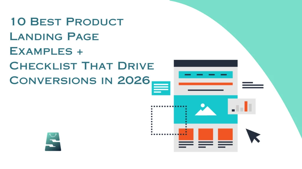
Most online stores attract visitors, but the ones that grow are the ones that convert them. And if there’s one thing separating a store that sells from one that only gets traffic, it’s the quality of its product landing page. Whether you’re a fashion seller in Lagos or a lifestyle brand in London, your product page does the heavy lifting, because it’s where shoppers decide to buy or bounce.
In this guide, you’ll find 10 real product landing page examples from both Nigerian and global brands worth learning from, the essential elements every high-converting page needs, and a practical checklist to apply it all to your own store.
Why Your Product Landing Page Is Your Most Important Sales Tool
Think of your product page as your best salesperson, one who works 24/7 and speaks to every potential customer who walks through your digital door. On average, only 2.17% of ecommerce site visits convert into purchases globally. That’s a tough number, but it also means enormous room to grow, and your product landing page is exactly where that growth happens.
A great product page doesn’t just show what you’re selling. It builds trust, guides shoppers through your sales funnel, answers objections before they’re asked, and makes buying feel like a natural next step. When done well, it helps reduce cart abandonment and keeps customers coming back.
Top 8 Essential Elements of a Product Page That Drives Conversions

Before looking at examples, it helps to understand what separates a high-converting page from an average one. These eight elements consistently make the difference. When you get them right, everything else becomes easier.
Here are the building blocks every product page needs:
- High-quality images: Show multiple angles, close-ups, and lifestyle shots. Products with six or more images consistently outperform those with fewer.
- Compelling product description: Lead with the benefit, not just the feature. Strong product descriptions answer questions before shoppers think to ask them.
- Clear pricing: Be upfront. Show discounts clearly and display relevant payment options. Paystack or Flutterwave for Nigerian shoppers, Apple Pay or Klarna for international buyers.
- Social proof: Ratings, reviews, and customer photos build the trust that turns browsers into buyers. Research shows 91% of consumers trust reviews as much as personal recommendations.
- Strong CTA: Your “Add to Cart” or “Buy Now” button should be impossible to miss, above the fold, high-contrast, and action-oriented.
- Trust signals: Return policies, secure payment badges, and delivery timelines reduce anxiety, especially for first-time buyers.
- Product specifications: Size guides, dimensions, and materials help shoppers commit without contacting support.
- Cross-selling: Recommending complementary products or bundles naturally lifts your average order value.
10 Product Landing Page Examples That Drive Conversions
Seeing the theory in action makes it stick. Here are the brands showing exactly what great product pages look like and why each one works.
1. Fabletics
Fabletics guides shoppers through a style preference quiz before presenting products, reducing choice overload and making the mobile ecommerce experience feel tailored rather than generic, making it feel like it was built for each individual shopper, and that personalisation converts, especially on mobile where scrolling through hundreds of options is exhausting.
- Use a short quiz or preference filter to match shoppers with the right product faster.
- Reducing choices improves both conversion rate and post-purchase satisfaction.
- Personalisation works especially well on mobile, where choice overload is amplified.
- A tailored experience drives stronger repeat purchase behaviour over time.
2. Rhode Skin
Rhode Skin’s product pages open with a short, low-definition video that immediately communicates the brand’s “effortless natural beauty” aesthetic. There are no lengthy introductions, the vibe is set in seconds, and the CTA follows quickly. For sellers in crowded markets, this is a reminder that identity communicates value faster than any bullet point can.
- Use a short hero video to communicate brand identity in the first five seconds.
- Low-production, authentic video often outperforms polished studio content on product pages.
- Set your aesthetic above the fold, don’t make shoppers scroll to understand your brand.
3. Maev
Maev sells raw dog food and its product pages replace ingredient text walls with recognizable food photography, real salmon, real eggs, and real vegetables. This helps buyers understand exactly what their pet is eating, without making the page feel clinical or complicated.
- Replace ingredient text lists with recognisable images wherever possible.
- Simplifying complex information visually is more persuasive than explaining it in paragraphs.
- Vet credentials and safety messaging should appear close to the CTA, not buried below.
4. Branch Furniture
Branch Furniture’s product pages open by immediately reassuring shoppers they’re in the right place. The pages pair clean product photography with dimensions shown in real room contexts, quick-filter options by team size, and prominent delivery and assembly information.
Key takeaways
- Show product dimensions in realistic room contexts, not just spec sheets.
- Filter options by use case (home, office, team size) reduce decision fatigue fast.
- Delivery and assembly details on the product page remove one of the biggest purchase blockers.
5. The Farmer’s Dog
The Farmer’s Dog leads with the emotional bond between owners and their pets, then backs it up with vet-approved credentials, media recognition, and a scroll-in graphic showing how fresh ingredients become a ready-made meal.
Key takeaways
- Lead with the emotional outcome your product delivers, not its ingredients.
- A visual process graphic builds confidence in product quality fast.
- Show the before-and-after transformation your product makes possible.
6. Glossier
Glossier loads product pages with user-generated photos and authentic customer reviews, creating a community-driven feel that resonates deeply. The brand trusts its customers’ voices more than its own.
Key takeaways
- Feature real customer photos alongside professional product shots.
- Make reviews easy to find, read, and filter by skin type or concern.
- Community-driven pages outperform polished-but-cold brand copy.
- Your customers’ words are your most credible marketing asset.
7. Allbirds
Allbirds clearly distinguishes its classic products from limited-edition drops. Sold-out colourways stay visible with a “notify me” option, turning unavailable stock into a lead generation opportunity and reinforcing genuine demand.
Key takeaways
- Label limited-edition items clearly and separately from evergreen products.
- Keep sold-out options visible with a restock notification sign-up.
- Honest scarcity builds desire; fake urgency destroys trust.
- Collect leads even when a product is temporarily unavailable.
8. Huel
Huel doesn’t just list a monthly subscription total, it breaks it down to cost-per-meal. This price reframing makes the product feel far more accessible, while a “3 reasons to switch” section speaks directly to specific buyer frustrations.
Key takeaways
- Break pricing into the smallest relatable unit like per meal, per use, per day.
- Address specific customer frustrations by name on the page.
- Subscription savings work best when displayed as a clear comparison.
- Proactively answer objections before shoppers leave to search for alternatives.
9. Away
Away turns practical luggage features such as battery packs, TSA-approved locks, and compression systems into lifestyle benefits with beautiful travel photography. Technical specs sit side by side with aspirational imagery, anchored by thousands of verified reviews.
Key takeaways
- Translate technical specifications into the real-life benefits they deliver.
- Pair product details with contextual lifestyle imagery.
- High review volume signals trust at scale better than marketing claims.
- Show your product exactly where and how your customer will use it.
10. Dollar Shave Club
Dollar Shave Club displays pricing and shipping costs immediately and removes one of the most common reasons shoppers abandon checkout. The tone is witty and direct, guiding shoppers to one clear decision without overwhelming them with options.
Key takeaways
- Show pricing and shipping upfront with no surprises saved for checkout.
- A confident, consistent brand voice carries your page from headline to CTA.
- Fewer choices per page means less decision fatigue and more conversions.
- Make the value of the offer obvious within the first scroll.
Product Page Checklist for 2026
A great product page doesn’t happen by accident. Before you publish, run every page through this checklist to make sure it’s ready to convert.
Visuals
- Include at least 6 high-quality images per product.
- Show multiple angles, key close-up details, and at least one lifestyle shot.
- Add a product video where possible, especially for fashion or high-ticket items.
- Enable zoom functionality on all product images.
- Compress all image files to keep the page loading fast.
Copy and Messaging
- Write a benefit-led product title that is clear and searchable.
- Craft product descriptions that answer real buyer questions.
- Highlight the top three benefits in scannable bullet points.
- Match your tone to your brand and to the audience you’re speaking to.
- Include relevant keywords naturally without over-stuffing.
Pricing and Offers
- Display pricing clearly with no hidden fees.
- Show original vs. discounted price where applicable.
- List all payment options, including local methods (Paystack, Flutterwave, bank transfer).
- Include a bundle or upsell option to increase average order value.
- State shipping costs and delivery timeframe upfront.
Trust and Social Proof
- Show your average star rating and total review count above the fold.
- Feature at least 10 recent, verified customer reviews on every product page.
- Add trust badges, secure payment, buyer protection, return policy.
- Include user-generated photos where available..
Mobile Experience
- Ensure your page loads in under three seconds on mobile.
- Make your CTA button visible without scrolling on all screen sizes.
- Use a sticky “Add to Cart” bar so the action button stays visible as shoppers scroll.
- Test your complete checkout flow on a real smartphone before launching.
- Preview the page on both Android and iOS to catch any display differences.
SEO and Technical
- Include your primary keyword in the product title, meta title, and first paragraph.
- Write a unique meta description for every product page, no duplicates.
- Add alt text to every product image using descriptive, keyword-relevant language.
- Use structured data (schema markup) so your product appears with rich snippets in search results.
- Check that all product URLs are clean, descriptive, and free of unnecessary parameters.
Conversion and UX
- Use a high-contrast colour for your main “Add to Cart” or “Buy Now” button.
- Remove distracting navigation links that pull attention away from the purchase.
- Show a progress indicator in the checkout so shoppers know how many steps remain.
- Enable guest checkout so first-time buyers don’t have to register.
- Offer an exit-intent prompt with a discount or reminder before shoppers leave.
Conclusion
Understanding what makes a great product page is one thing, building one that actually works for your specific store, your specific products, and your specific audience is another. That’s where having the right partner makes all the difference.
ShopinBos is an ecommerce enablement platform built to help sellers across Nigeria and beyond launch, manage, and grow online stores that convert. Whether you’re starting from scratch or improving what you already have, ShopinBos brings together the tools, guidance, and platform expertise to help you build product pages that move customers from interest to checkout, consistently and confidently.
FAQs About Product Landing Page Examples
A regular product page lives inside your store’s navigation and serves shoppers who are already browsing. A product landing page targets a specific audience or campaign, strips out distractions, and focuses on one conversion action.
Six to eight images consistently outperform pages with fewer. Cover multiple angles, close-up details, and at least one lifestyle shot showing the product in use. For fashion or higher-ticket products, adding a short video can lift conversion rates significantly, especially on mobile, where shoppers want to see a product move before they commit.
Unexpected shipping costs, overly long checkout forms, and limited payment options are the three most common culprits. To reduce cart abandonment, display all costs upfront, offer guest checkout, support payment methods your audience actually uses including local options where relevant and add trust signals directly on the checkout page.