
You’ve spent hours creating that product you’re excited about. Maybe it’s a digital planner, cookbooks, or handmade candles. But now comes the part that leaves you feeling overwhelmed and frustrated: writing a sales page that convinces people to buy.
Here’s some good news: you don’t need copywriting courses or years of experience to create a sales page that converts visitors to customers. What you need is a clear structure, an understanding of why people buy, and the willingness to speak directly to your customer’s needs. Let’s break down exactly how to do this, step by step.
Why Your Sales Page Is Your Most Important Asset
Think of your sales page as your salesperson who works 24/7 without taking breaks. While your homepage gives an overview and your product listings provide options, your sales page has one laser-focused job: persuading someone to take action on a specific offer, without feeling forced.
Understanding first that your sales page isn’t just another webpage, but a dedicated landing page built around a single product or offer, that guide visitors toward hitting that “buy” button, after they get the sense of whether your product is worth their money, is the first step towards towards how to build a sales page that converts!
The Psychology Behind Buying Decisions (Keep It Simple)
Before you write a single word, understand this fundamental truth: people don’t buy products. They buy solutions to problems, feelings they want to experience, or outcomes they desire.
The Real Reasons People Click “Buy Now”:
- They want to save time or money
- They’re frustrated with current solutions that don’t work
- They fear missing out on something valuable
- They want to feel a certain way (confident, organized, relaxed)
- They need to solve a pressing problem quickly
When crafting your sales page, always connect your product to these deeper motivations. This emotional connection transforms casual browsers into immediate and committed buyers.
Key Aspects of a High-Converting Sales Page
Now that you know what a sales page is and why people buy, let’s explore the core elements of a sales page that actually converts. Think of these elements as your blueprint that you’ll customize for your specific product description.
1. A Crystal-Clear, Benefit-Driven Headline
Your headline has approximately three seconds to capture attention. Skip the clever wordplay and directly answer: “What’s in this for me?”
Weak headline: “Premium Essential Oil Diffusers”
Strong headline: “Transform Any Room Into a Relaxing Spa (Without Spending $200 on Fancy Equipment)”
Notice how the strong version focuses on the outcome and feeling, not just the product category.
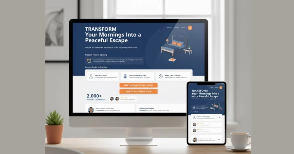
2. Problem-Focused Opening That Creates Connection
Start by acknowledging your customer’s frustration or challenge. This creates an instant “they get me” moment that builds trust.
Example opening: “Tired of waking up in a cluttered bedroom that makes mornings stressful? You’re not alone. Most people spend the first 15 minutes of their day searching for things instead of starting fresh.”
Then transition smoothly into presenting your product as the solution they’ve been searching for.
3. Benefits That Speak to Real Life (Not Just Product Features)
This is where most beginners stumble. Features describe what your product is. Benefits explain what it does for your customer’s life.
Feature: “Waterproof Bluetooth speaker with 12-hour battery”
Benefit: “Take your favorite music anywhere — from poolside parties to camping trips — without constantly searching for outlets or worrying about water damage”
Always lead with benefits, then support them with the features that make those benefits possible. At Shopinbos, we help first-time sellers understand these distinctions through practical guides that translate theory into real-world application for your store.
4. Social Proof That Builds Credibility
People trust other people far more than they trust companies. Even as a beginner, you can gather proof:
- Customer testimonials (offer free samples in exchange for honest reviews)
- Number of units sold or customers served
- Before-and-after photos
- User-generated content from social media
- Expert endorsements or certifications
Place testimonials strategically throughout your sales page, not just lumped together at the bottom.
5. Clear, Action-Oriented Call-to-Action Buttons
Your CTA should appear multiple times and use specific, action-driven language. Instead of generic phrases like “Click Here” or “Learn More,” use compelling alternatives:
- “Start Sleeping Better Tonight”
- “Get My Discount Now”
- “Join 2,000+ Happy Customers”
Make these buttons visually notable with contrasting colors that stand out from your page design.
6. Address Their Doubts Before They Become Deal-Breakers
Think about every reason someone might hesitate, then proactively address those concerns in your copy:
- Price concerns: Emphasize value, compare to alternatives, offer payment plans
- Quality doubts: Provide guarantees, show certifications, display high-quality images
- Trust issues: Highlight secure checkout, return policies, customer service availability
- Uncertainty: Create FAQ sections, offer detailed product descriptions
Optimizing Your Sales Page for Maximum Conversions
Writing the copy is just the foundation. These optimization strategies push your conversion rate higher.
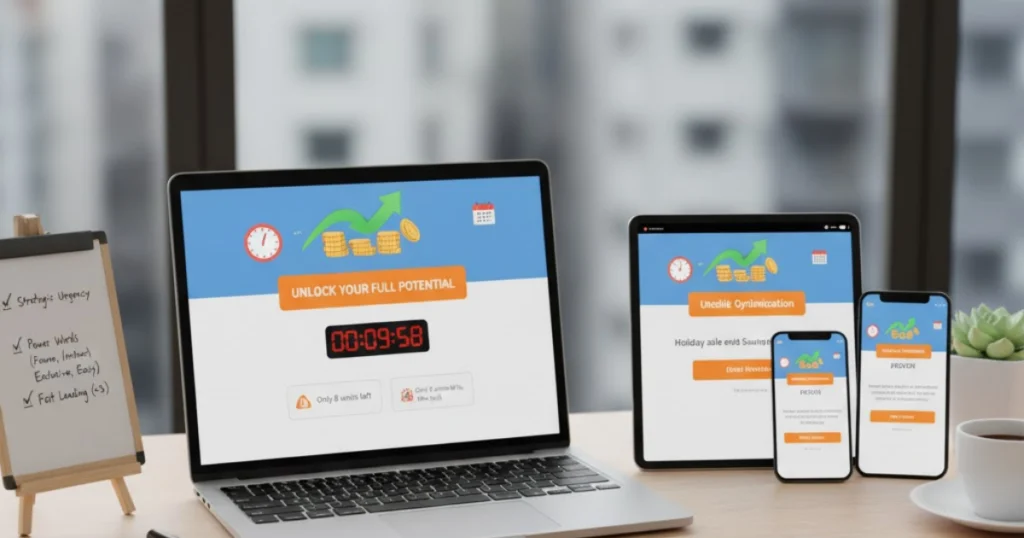
Create Strategic Urgency
Limited-time discounts, countdown timers, or low-stock notifications encourage immediate action. However, maintain authenticity — false scarcity damages your reputation.
Examples of honest urgency:
- “Holiday sale ends Sunday at midnight”
- “Only 8 units left in this batch”
- “Early bird pricing for the first 50 customers”
Optimize Every Element for Mobile Users
Over 60% of web traffic comes from mobile devices. Test your sales page on multiple screen sizes to ensure:
- Text is readable without zooming
- Buttons are large enough for thumb tapping
- Images load quickly and display properly
- Forms are simple to complete
- Page loads in under 3 seconds
Use Power Words That Trigger Action
Certain words create emotional responses that drive decisions. Sprinkle these throughout your copy naturally:
- Proven, guaranteed, instant, exclusive
- Easy, simple, effortless, quick
Testing and Improving Your Sales Page Over Time
Your first version won’t be perfect, and that’s completely expected. The key is launching, gathering real data, and making informed improvements.
Track These Critical Metrics:
- Conversion rate (percentage of visitors who buy)
- Average time on page
- Bounce rate (people who leave immediately)
- Click-through rate on CTA buttons
- Cart abandonment rate
Google Analytics provides these insights for free. Use heatmap tools like Hotjar to see exactly where visitors click and how far they scroll.
Building your online business involves coordinating multiple moving parts — from product sourcing to payment processing to marketing strategies.
Common Sales Page Mistakes to Avoid
Focusing Too Much on Features Remember: customers care about outcomes, not specifications. Always translate features into meaningful benefits.
Making Your Page Too Long or Too Short Length should match product complexity. Simple, inexpensive items need 500-800 words. Higher-priced or complex products often require 2,000+ words to address concerns thoroughly.
Burying Your CTA Don’t make visitors hunt for the buy button. Place it above the fold, in the middle, and at the end.
Ignoring Load Speed A one-second delay in page load time can reduce conversions by 7%. Compress images, minimize code, and use reliable hosting.
You now have a complete blueprint for creating a sales page that converts. Start with this structure, infuse it with your authentic voice and customer insights, then refine based on real-world performance. Your sales page isn’t a one-time project — it’s an evolving asset that grows stronger with every optimization.
At Shopinbos, we’ve created comprehensive, beginner-friendly resources that walk you through every aspect of launching and growing your eCommerce store. Our multi-platform approach means you get actionable advice regardless of whether you’re using Shopify, WooCommerce, or any other platform.
Frequently Asked Questions
Do I really need a separate sales page, or can I just use my product page?
Sales pages allow for deeper storytelling, more comprehensive benefit explanations, and strategic persuasion elements that standard product templates don’t accommodate.
How do I write a compelling copy if my product isn’t unique?
Focus on your unique angle, target audience, or brand story rather than product uniqueness. Two people selling similar yoga mats can differentiate through who they serve (beginners vs. advanced practitioners), their brand values (eco-friendly vs. performance-focused), or their customer experience (educational content vs. quick transactions).
Should I include pricing on my sales page or make people click to see it?
Generally, include pricing directly on your sales page. Transparency builds trust and filters out non-serious buyers early. The exception is high-ticket items or customizable products where “request a quote” makes sense.
Can I create an effective sales page without spending money on tools?
Absolutely. Start with free page builders like WordPress, use free stock photo sites like Unsplash or Pexels, write copy in Google Docs, and track results with Google Analytics. Invest in paid tools only after validating your concept and generating revenue.